rediculous image
Community Forums/Graphic Chat/rediculous image
| ||
| OK... i did this in an hour.. can ppl point out ne flaws... cuz i wanna make it better... when you are pointing out flaws stick to how well it is done.. not wat it is of... cuz i know its stupid.. just humor me.. plz?  |
| ||
| try this: -select everything but the orange, -do a contrast increase on the rest (may need to adjust brightness up to compensate) -do 1 maybe 2 unsharp masks this should clean up/enhance the photo a little. -invert selection and do a contrast reduction on orange only -you will have made a seam doing this so select seam pixels and soften -because of the poor quality of the photo i also reccomend a resolution decrease. Personally i would promote the orange to its own layer to make it easier to work on but is not necessary. |
| ||
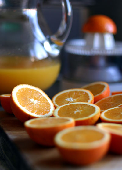
| The orange is too thin by far. It should be a half orange - like one of these:  It somewhat shocks me that you did not use a half orange - I find this somewhat unproffesional and lacking in maturity. It kind of lowers the tone of the whole image and I certainly find it terribly offensive that you chose such a thin slice of orange. It is almost like oranges are not good enough for you. I mean, what exactly is your problem? It's like introducing your girlfriend to people and then (behind her back) apologising to people that she isn't much of a looker. I really do find this attitude terribly, terribly distasteful. I bet you don't even know what variety of orange you have used - I bet you don't even care. I bet that orange means as much to you as the breath you took four hours, 3 minutes and 16 seconds ago. Yeh, you don't remember it do you? You disgust me - you absolute monster. |
| ||
| I see Puki is back in Action. :) |
| ||
| my comments,... 1. If you can, find an in-focus picture to use instead,... seriously. 2. Match the focus of the orange to the photo,... you will have to blur it to match the photo blur. 3. Way too much saturation on the orange. When doing photo manipulations, it's all about matching the different sources as close as possible. Blur, lighting, contrast, color balance,... |
| ||
 This is the best i could do for it in 5 minutes. you can see what i/we mean by trying to balance the luminosity and saturation of the two images. I basically did what steps i mentioned in my first reply. You can also see the effect of the unsharp mask (a wonderful tool!) |
| ||
| try adding some shade around the head on the fingers,arm & body just a bit |
| ||
| i agree. -You also need to work on the neck area, its a little rough where the base of the neck meets the shoulders and shirt. -there is a visible seam on the head like scribbla says |
| ||
| Thanks Guys. |
| ||
| i did notice the neck area... yea.. thanks alot.. edit* srry about the double post |
| ||
| It is almost like oranges are not good enough for you. I mean, what exactly is your problem? It's like introducing your girlfriend to people and then (behind her back) apologising to people that she isn't much of a looker. I really do find this attitude terribly, terribly distasteful. Yeah, what's with the orange prejudice? I can't believe the mods haven't removed the image or deleted this topic. Nice b3dcoder, looks like a fun little paintshop project. |
   |