Would appreciate some feedback
Community Forums/General Help/Would appreciate some feedback
| ||
| I'm currently messing around with changing my Photon Game Manager website and am trying to design a new logo/banner. My graphic design skills are somewhat lacking but I'm got something I'm partially happy with, I'd just like to get some feedback from other members on good/bad/things to change. Thanks in advance for your time :) Logo:  Option 1:  Option 2:  Option 3:  |
| ||
| For me, you've got way too many colors/shades in it. Most logos only contain a couple of colors - the simpler it is, the more memorable/identifiable it is. https://www.google.co.uk/search?q=logo&rlz=1C1CHFX_en-GBGB546GB546&es_sm=122&source=lnms&tbm=isch&sa=X&ei=P1TNVMS3PIzWaoyngJgO&ved=0CAgQ_AUoAQ&biw=1366&bih=624 |
| ||
| The logo..the smaller icon...looks a bit dirty around the edges....there seems to be a bit of noise in the image. |
| ||
| IMHO: - First one looks OK... - Second one looks nice too, albeit perhaps a bit too reminiscent to the Adobe Photoshop icon - Third one looks like it has a poorly selected mask with floodfill applied to it, the gradient towards the purple on the right is much too sharp and distracting, giving it a much more amateurish feel than the other two. |
| ||
| I agree with GFK: simple design, less colour. I suggest to keep the 'p' (on some neutral & colid colour background) and add (or remove) some pixels around the P to refer to something like particles, sprites, joypad etc (just to 'inspire' something game-related). The 'texture' has not meaning for me, just some chaos. |
| ||
| For those available I would take option 2 because of it's clean lines. -Henri |
| ||
| PhotonTom, I just wanted to say that the question that you posed sounds like the mark of a great artist. A great artist is very detail oriented like you are. All 3 options look great. They�re just slightly different from the other, but based on even a very very SLIGHT difference in the 3 pieces, such have trouble deciding which way to go with the piece. I have this problem when I draw, write music, or write stories. People could tell me my drawings, music, or stories are perfect, but I may not think so because of one SLIGHT thing that I think is wrong or ONE slight dot that I think is out of place LOL. This was quite a problem for me when I wrote essays in college. I've always wanted my essays and research papers to be absolutely PERFECT and if the professor made ONE mark on my paper as indicating that anything was wrong, that ruined my week LOL. I think the composer Beethoven had this problem too when he composed his symphonies. Anyway, I'm just ranting. |
| ||
| GfK: For me, you've got way too many colors/shades in it. Most logos only contain a couple of colors - the simpler it is, the more memorable/identifiable it is. Hmmm!... Not too keen on this one though!. :p |
| ||
| Hmmm!... Not too keen on this one though!. :p ...But you can't argue that it isn't memorable? ;-) Photontom: I do like the lettering/font that you chose, looks pretty clean. |
| ||
| Thank you everyone for your valuable feedback :) @steve_ancell Full article here: http://www.hongkiat.com/blog/logo-design-gone-wrong/ Some of them are brilliantly bad @Matty Yeah I forgot to clean that one up, was more focused on the banner @En929 Thank you for your kind words @Henri Yeah that was my favourite as well and works well for both a banner and logo. @GfK I agree with you on that one, this is exactly why I needed feedback, sometimes I miss the obvious. Guess its back to the drawing board. |
| ||
Ok I've been messing about with more logo ideas. These are far from perfect and I haven't added any colour yet but I would love feedback on them again. My favourite ones are the controller on a circle but I'm afraid that is too generic and isn't very good as a brand logo. |
| ||
| The sun sign look good for P and you got be careful of copyright on joypad thought as it look like Playstation as you dont want sony getting wrong idea on your game joypad picture. |
| ||
| If I'm honest none of them really grab me however the bottom right with the p in the pc screen stands out quite clear. |
| ||
Here ya go... I took out the game manager, as that can be added separately.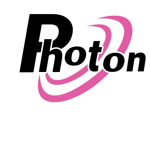 |
| ||
| @Adam Maybe reuse the "swooshes" in a way they move away from the round part of the "P". I am not at my workstation now, so ascii art will have to do: .--. . . . | | ) ) ) |--' ' ' ' | |.-. .-. .|. .-. ,.-. | | | :_: |_ :_: | | Just imagine the swooshes behind the characters and not that strict aligned as in my ascii art (more growing to the bottom as in you suggestion) For now there is many variation in the glyph alignment (P_undercut_h upper-o, normal "ton"). Maybe that builds up a symbol for "photons" (the physical thing ... electromagnetical waves etc.) bye Ron |
   |